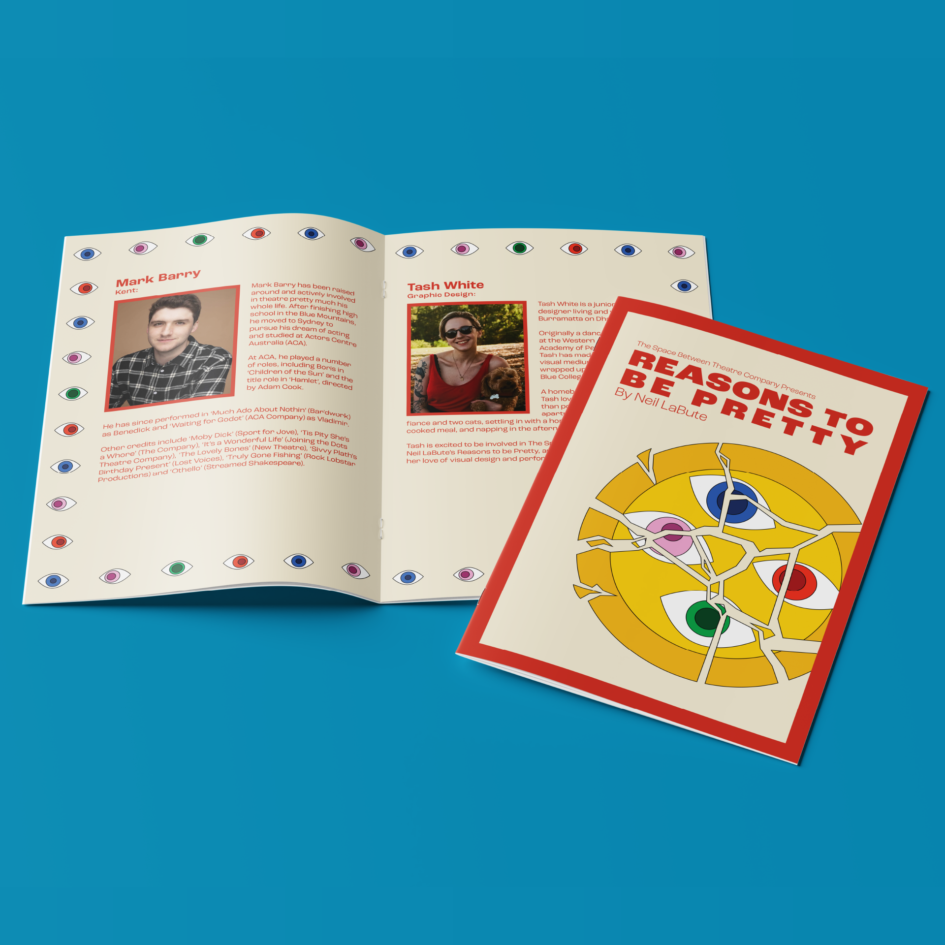
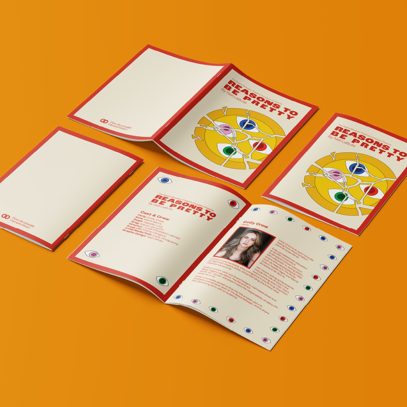
Sydney-based theatre company, The Space Between, contacted me to create marketing materials – specifically posters and a show program – for their production of Neil LaBute’s Reasons To Be Pretty, performed in late 2024. I was given almost complete creative freedom across the project, and found that the client and I aligned nearly perfectly all the way through from concept to final production.
the execution:
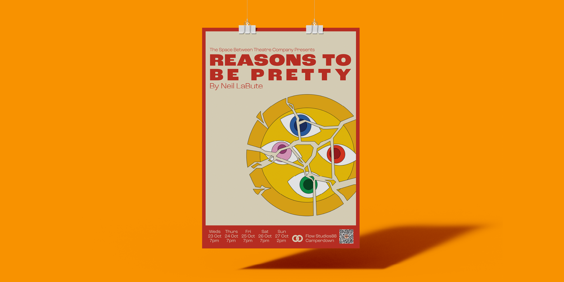
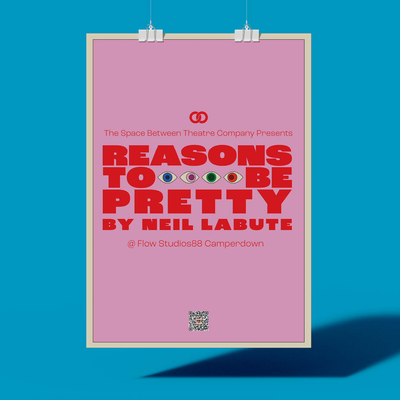
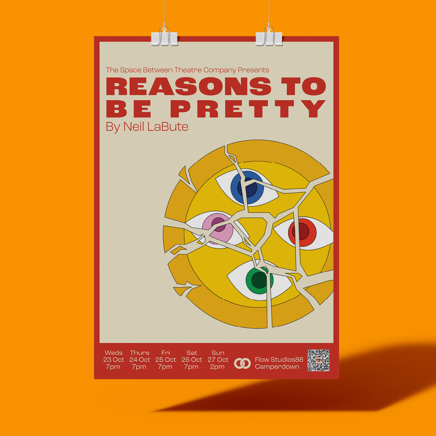
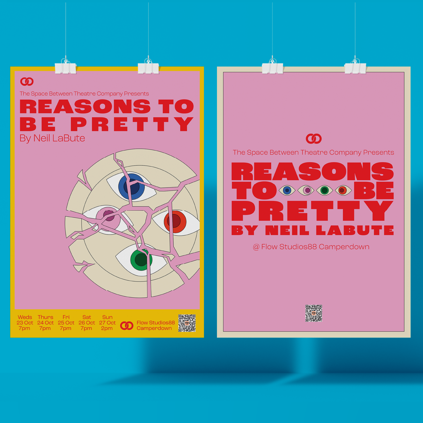
To get a good feel for the production I was designing for, I read the opening act of Reasons to be Pretty, and found myself continually circling back to imagery involving eyes and shattering plates. The client and I agreed that our main sources of inspiration were vintage travel posters, as well as film posters designed by Saul Bass specifically.
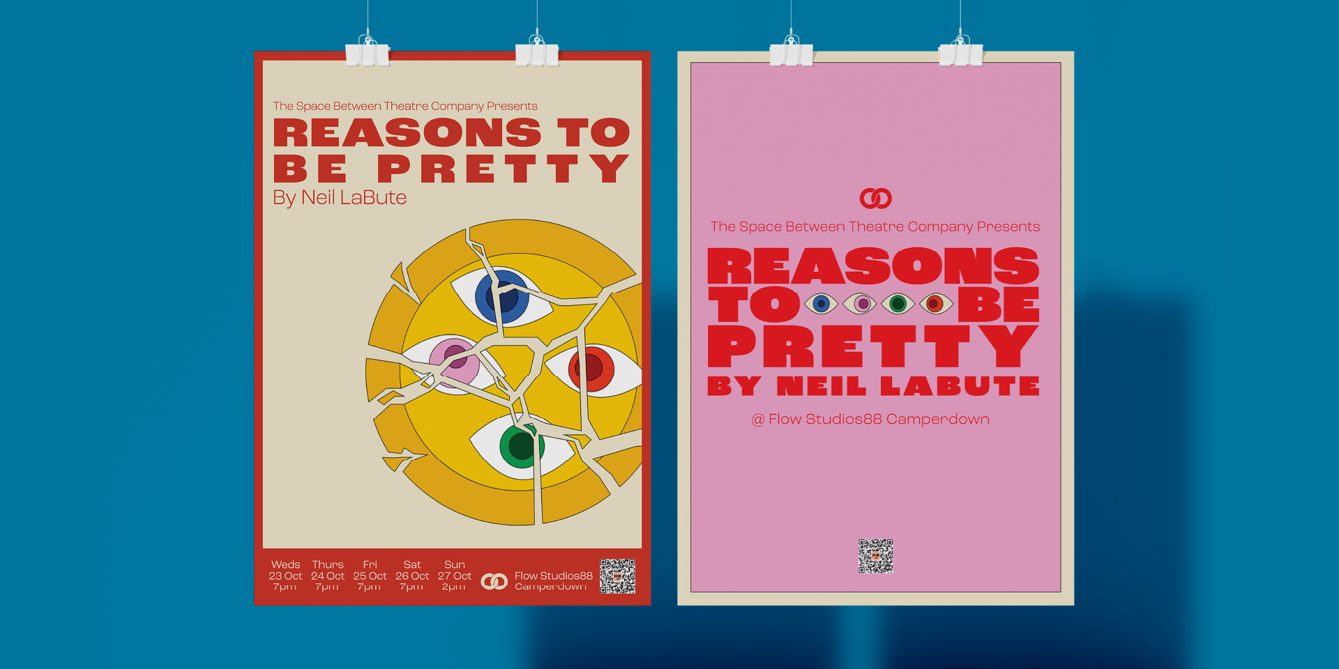
Leaning into this, I took cues from the dissected illustration used by Bass for Anatomy of a Murder, channeling this idea into a shattered plate featuring eyes belonging to the four characters in the play all watching each other with suspicion.
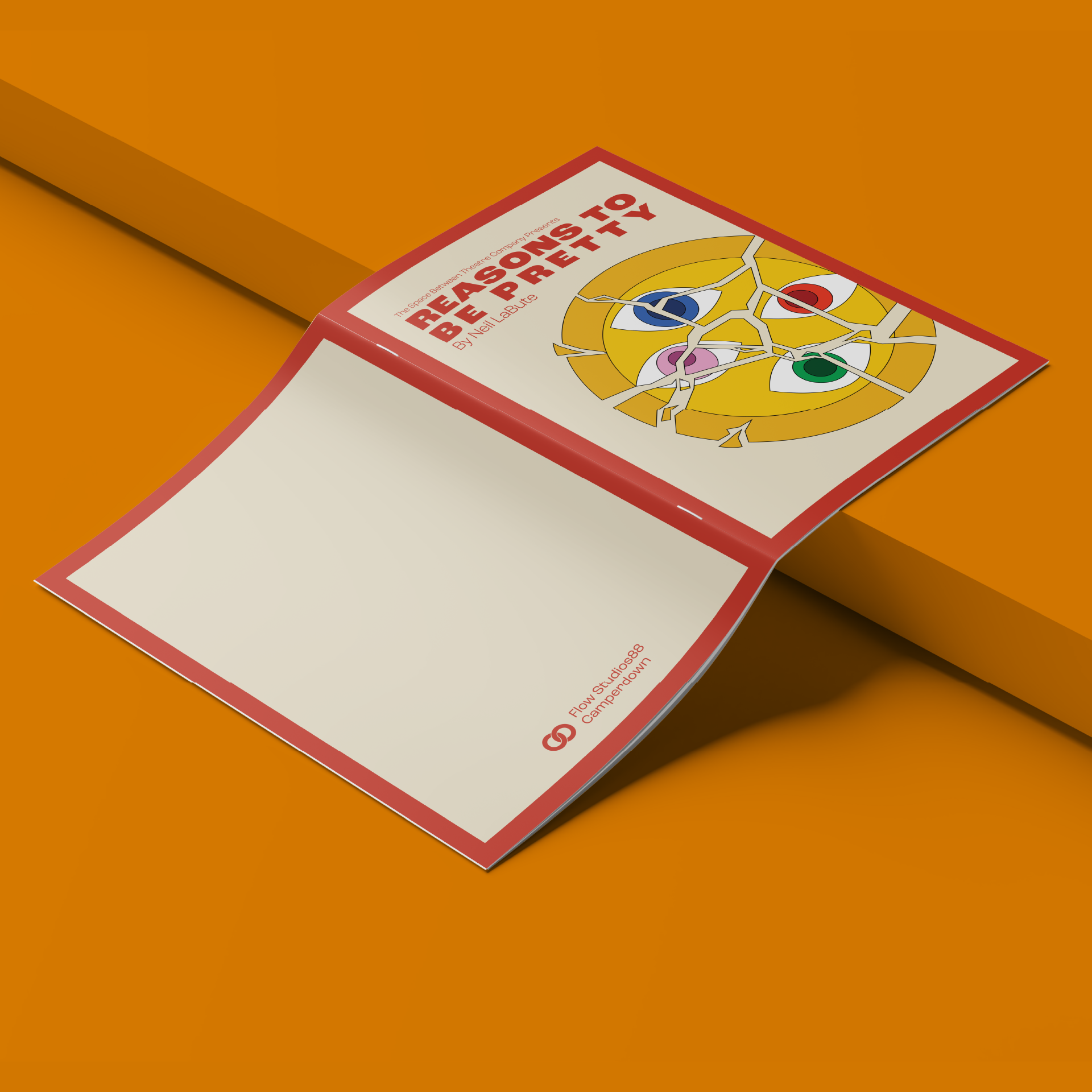
I refined two different designs, with two different colourways for final approval, with both the client and myself agreeing that the final design in the red/yellow/beige colourway was the most impactful, and grounded within the story itself.
Reasons to be Pretty was performed at Flow Studios in Sydney, in October 2024, with most shows selling out.