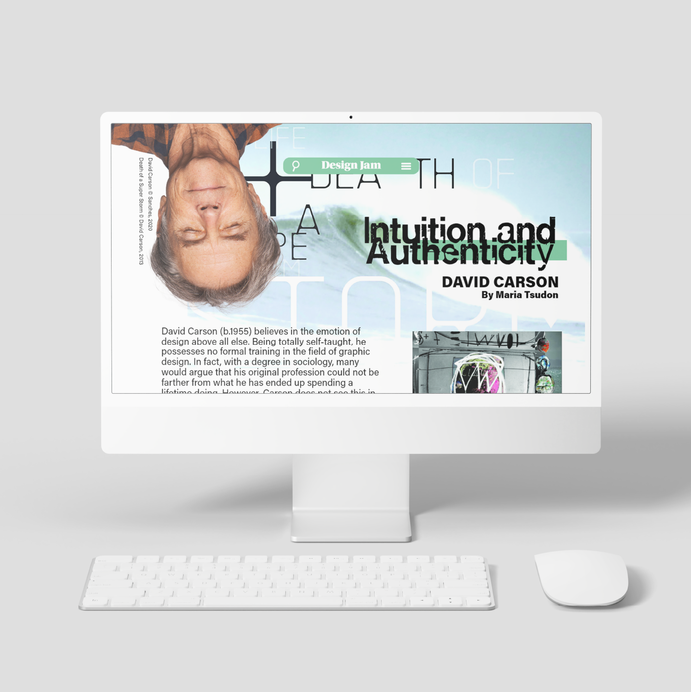
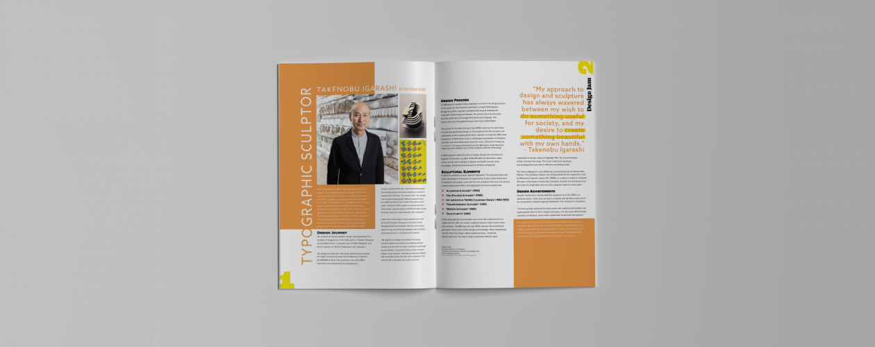
Completed across two assignments for Publishing & Media as part of the Diploma of Graphic Design at Billy Blue College of Design, the brief was fairly straightforward: using my knowledge of typography and layout design, design a multi-page double spread magazine article informed and reminiscent of a designer of our choice. In my case, this was David Carson. From there, I was tasked with adapting the design to mobile, tablet, and desktop digital formats.
the execution:
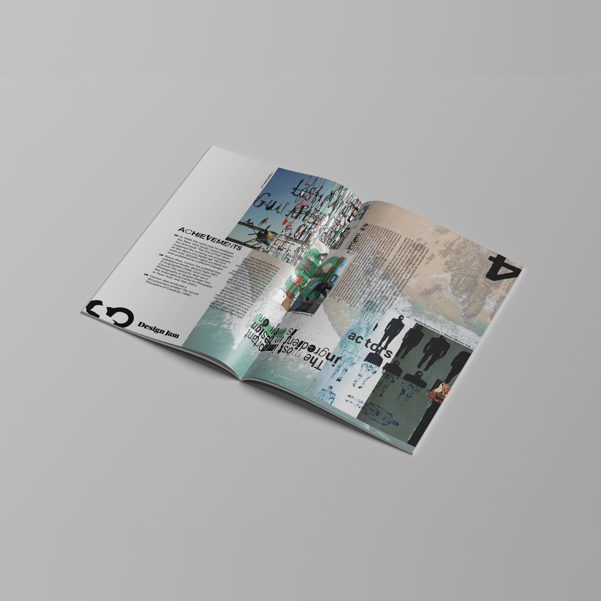
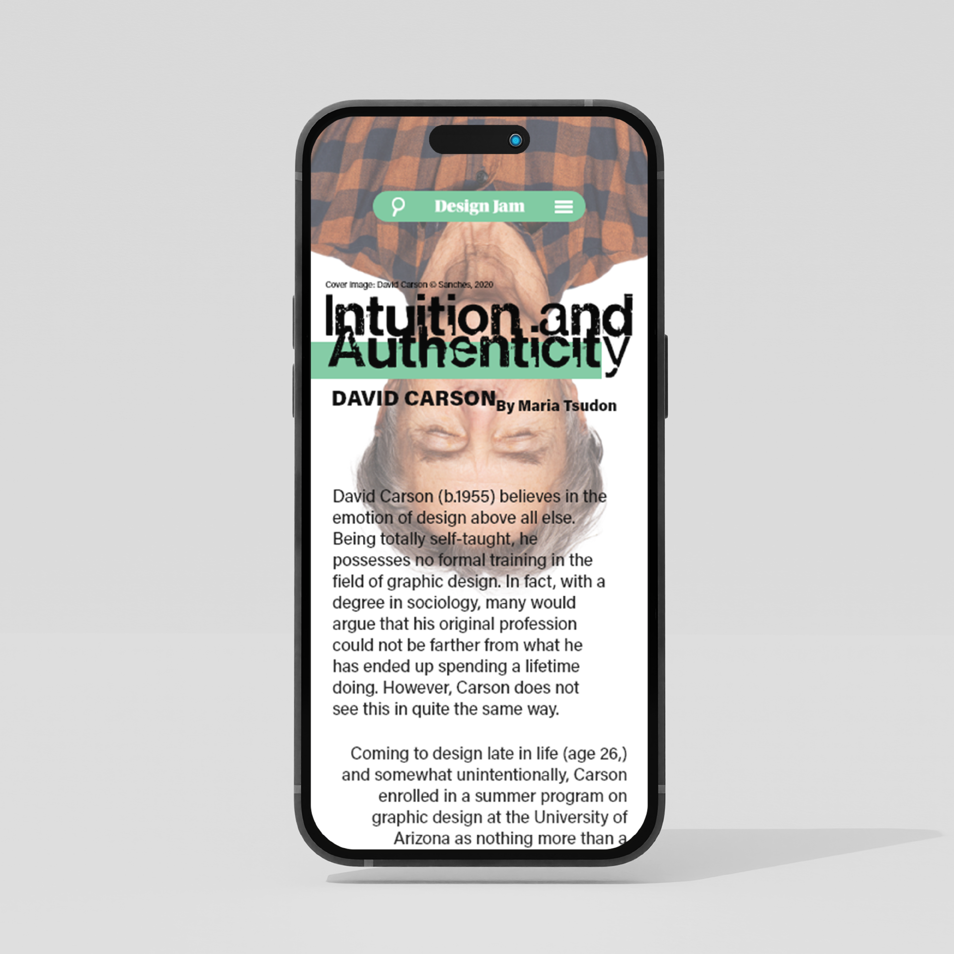
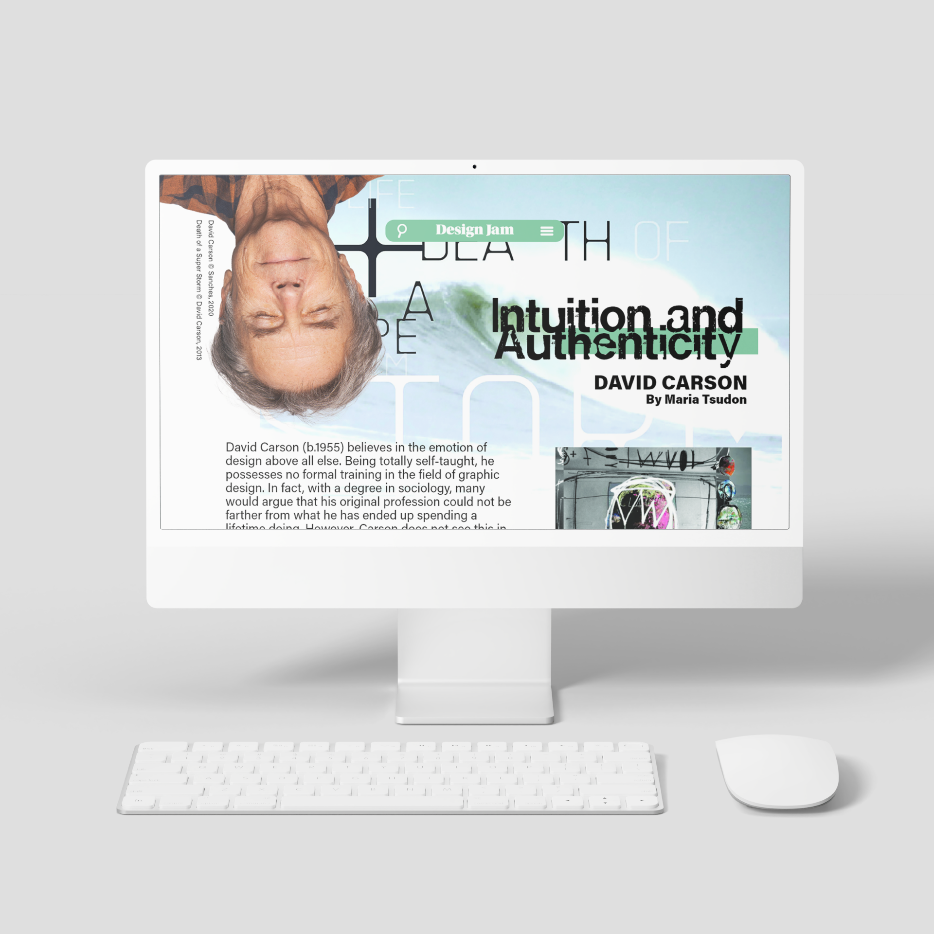
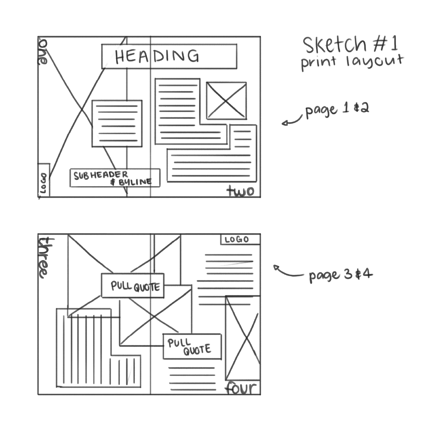
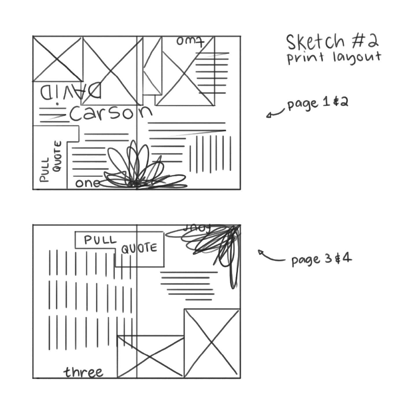
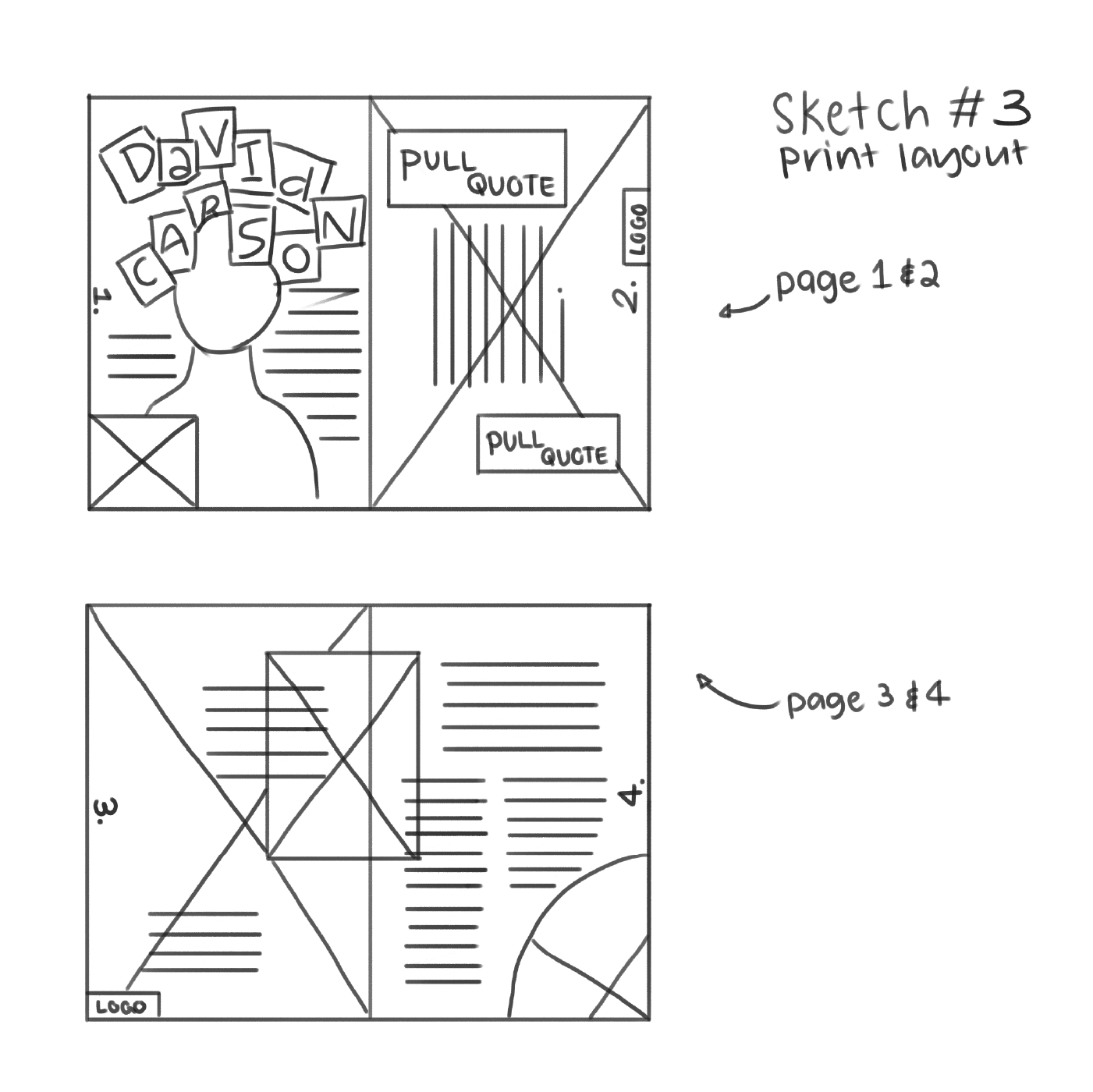
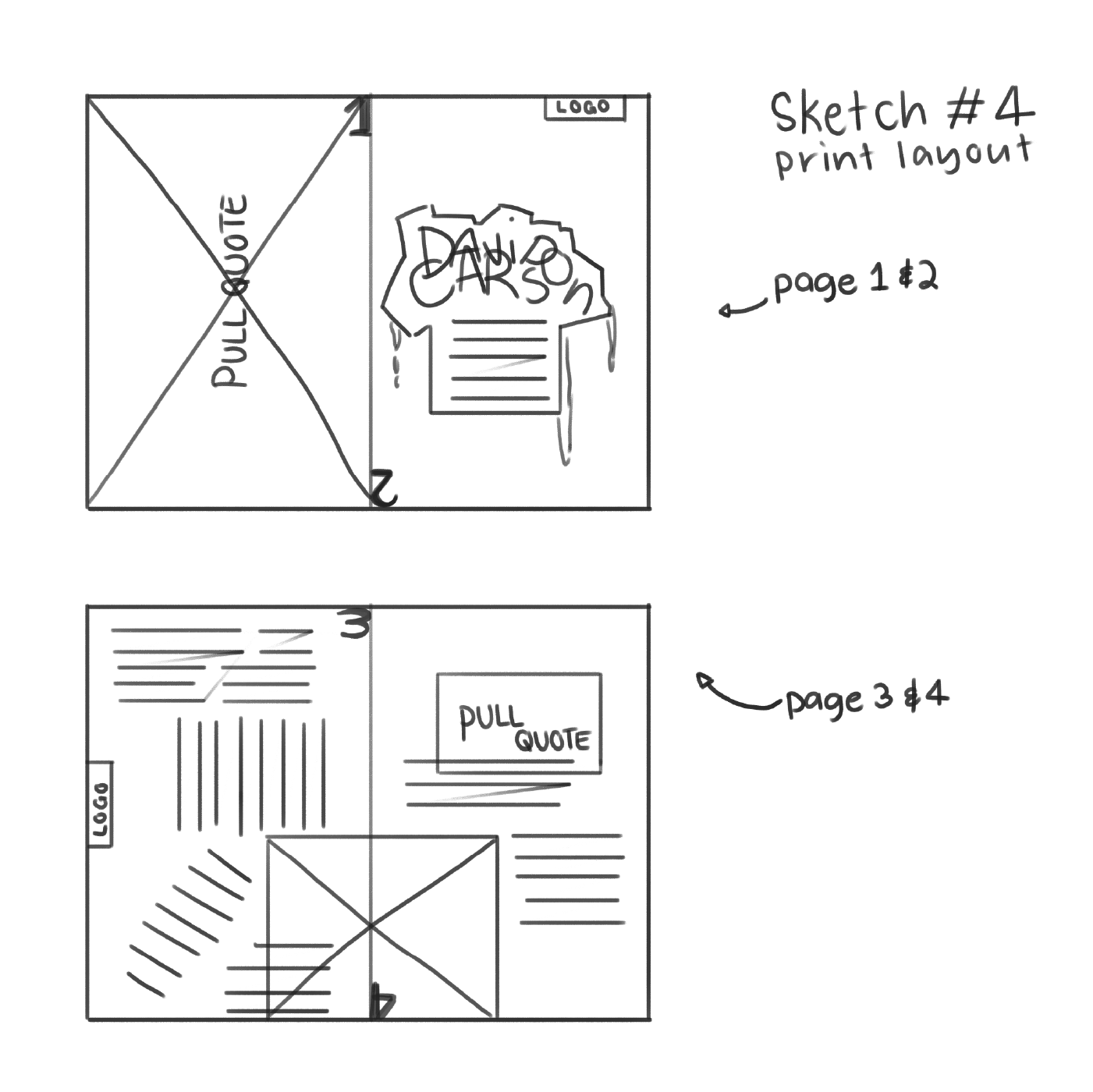
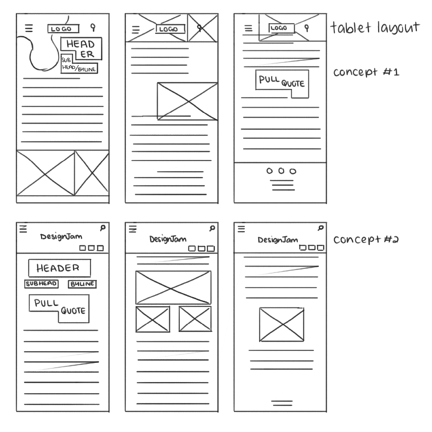
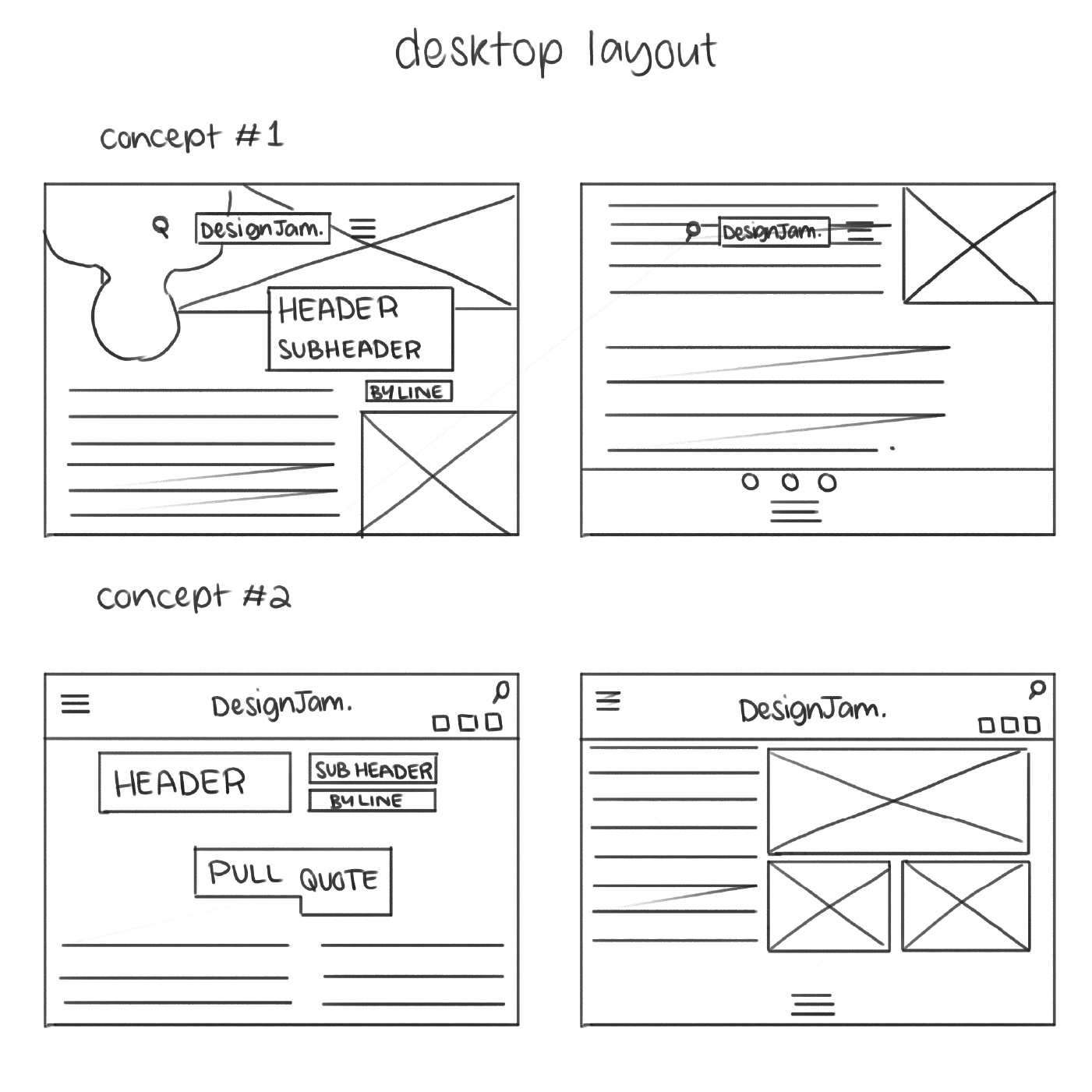
It was necessary to begin these assignments with extensive sketching and exploration, and I found myself taking cues from Carson’s own work for Raygun magazine, as well as Chris Ashworth who is also an alumni of Raygun magazine. For the responsive digital designs, much of my inspiration came from The Face magazine’s website (which I’m still obsessed with).
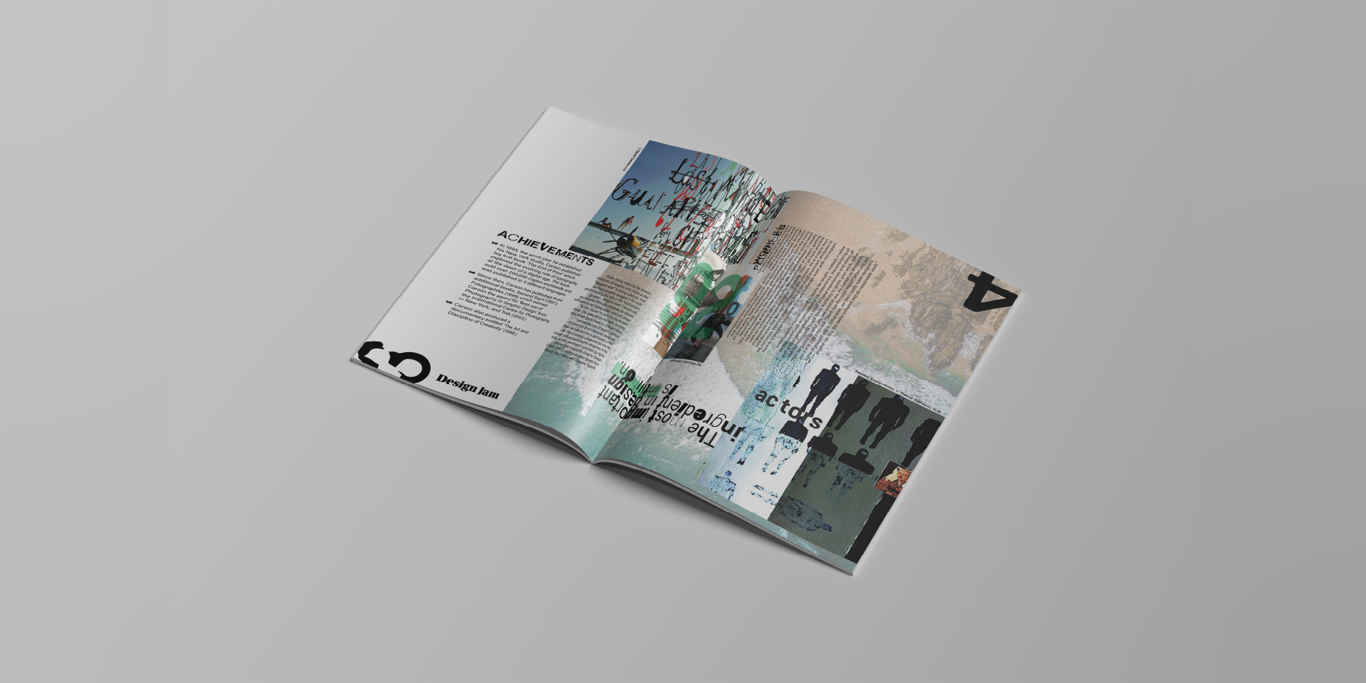
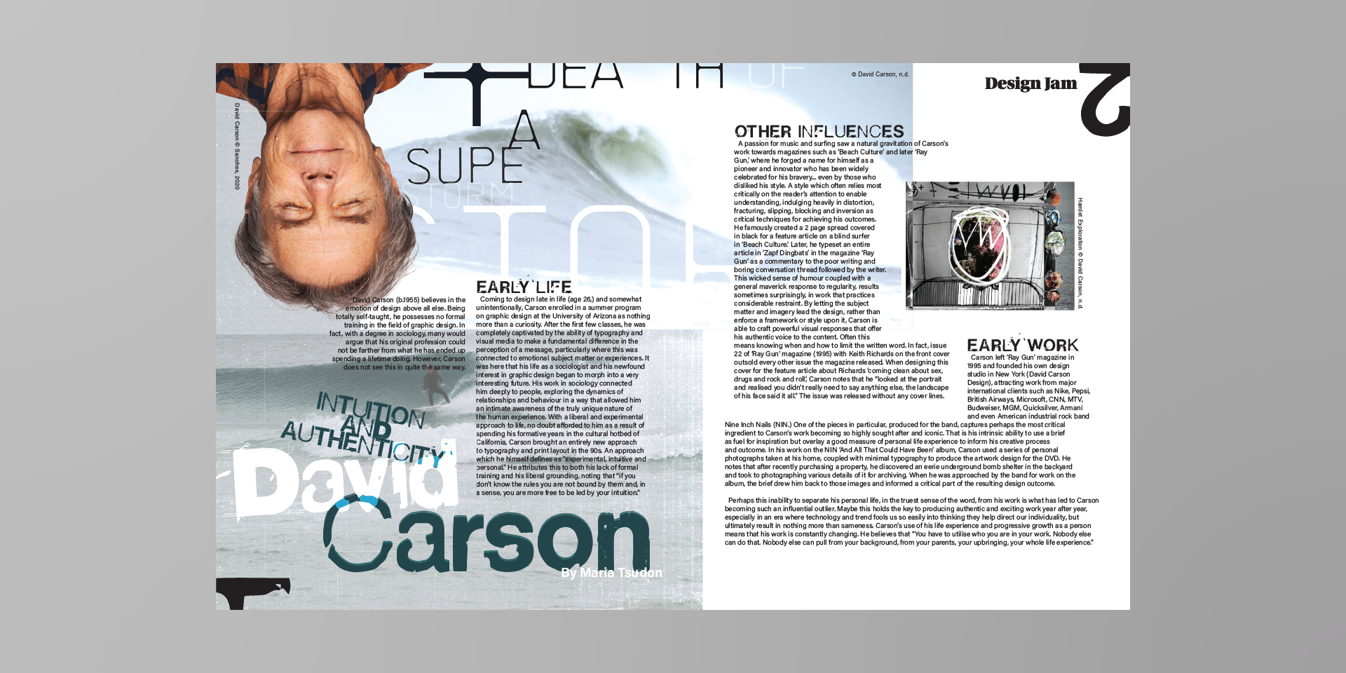
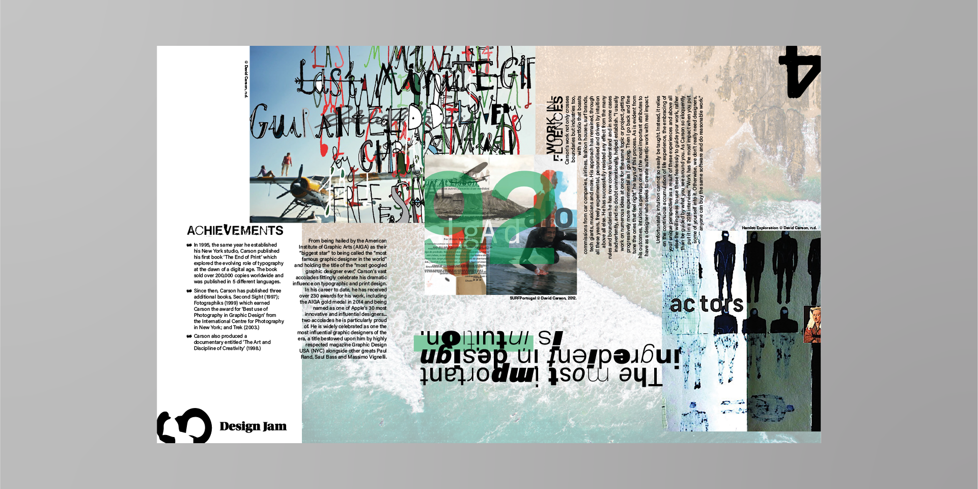
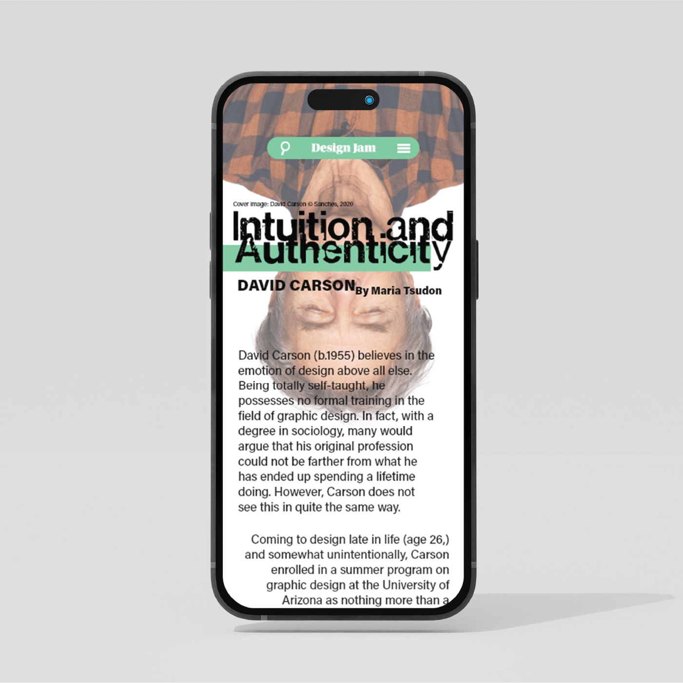
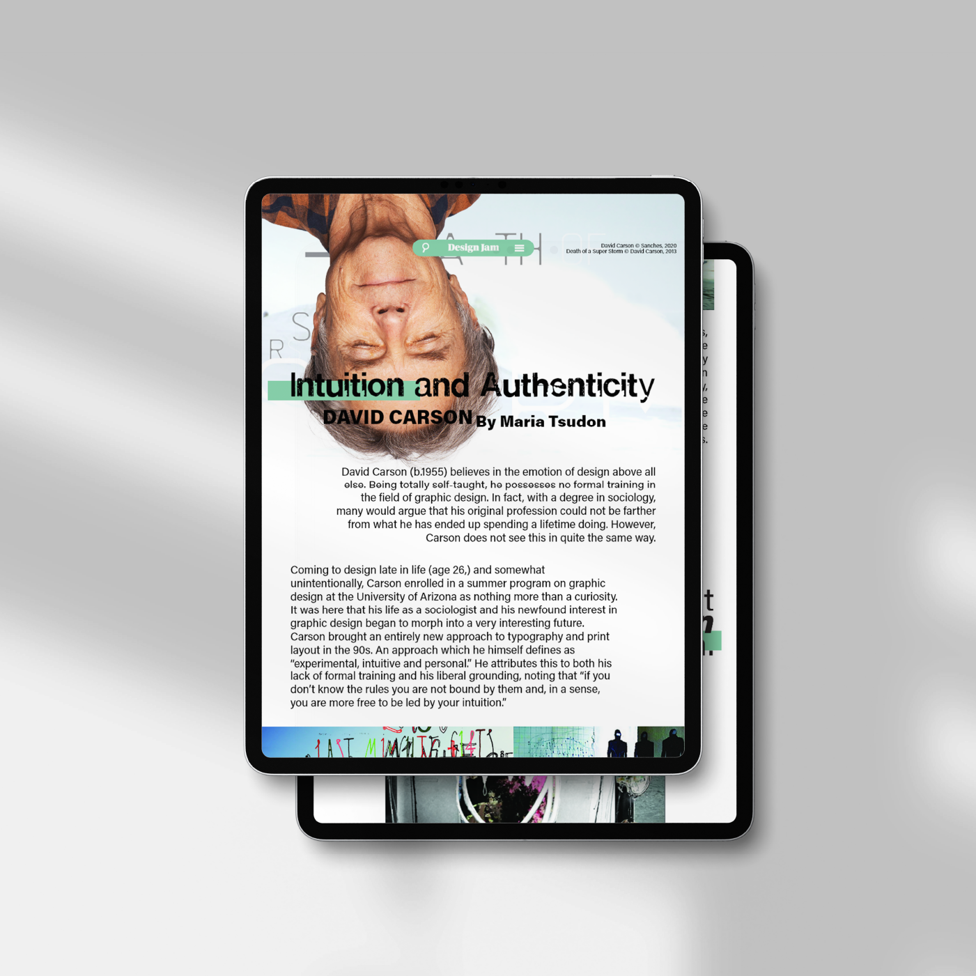
When constructing the final print design, I zeroed in on the idea of pushing the limits of legibility, leading to almost haphazard alignment of entire paragraphs, and lots of overlapping elements.
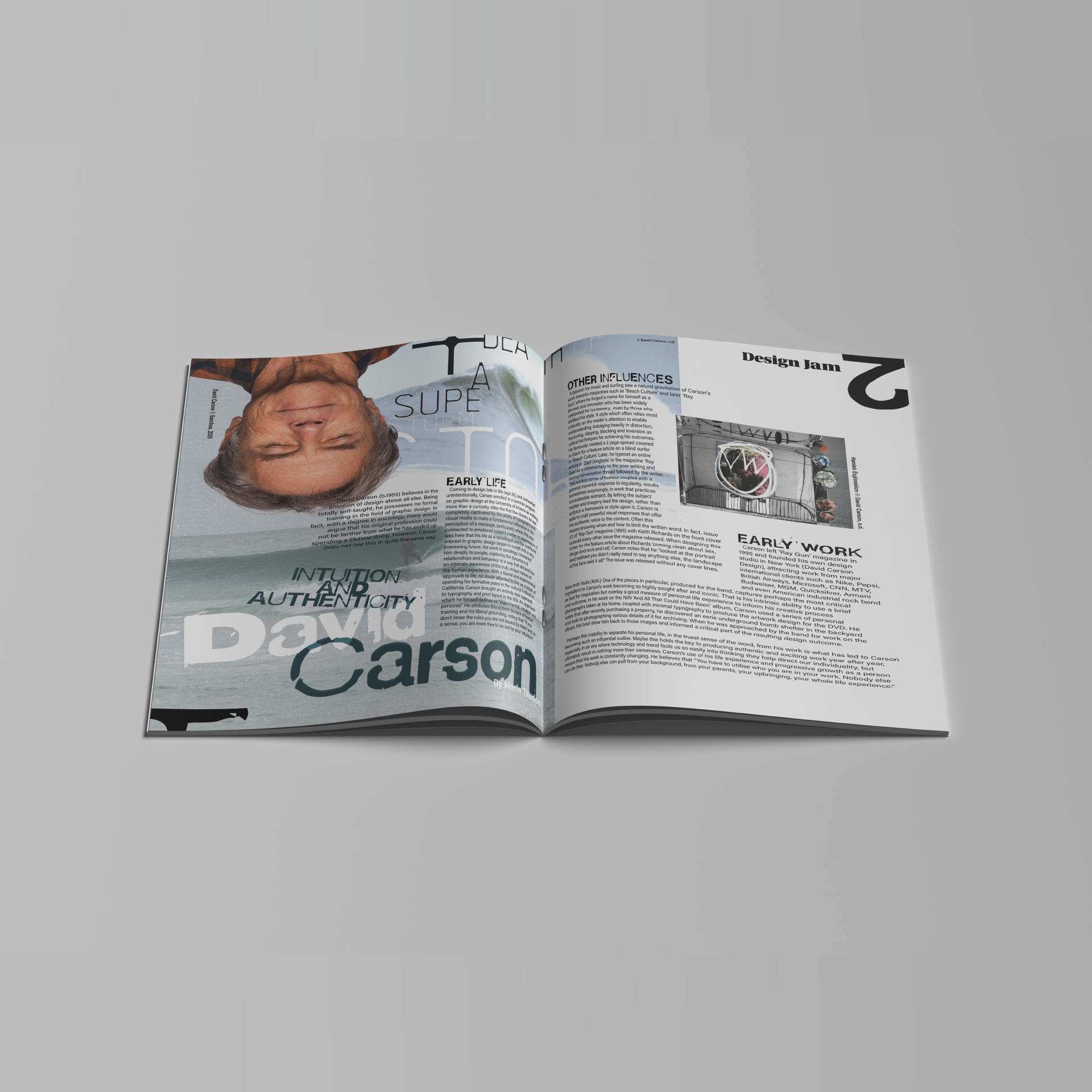
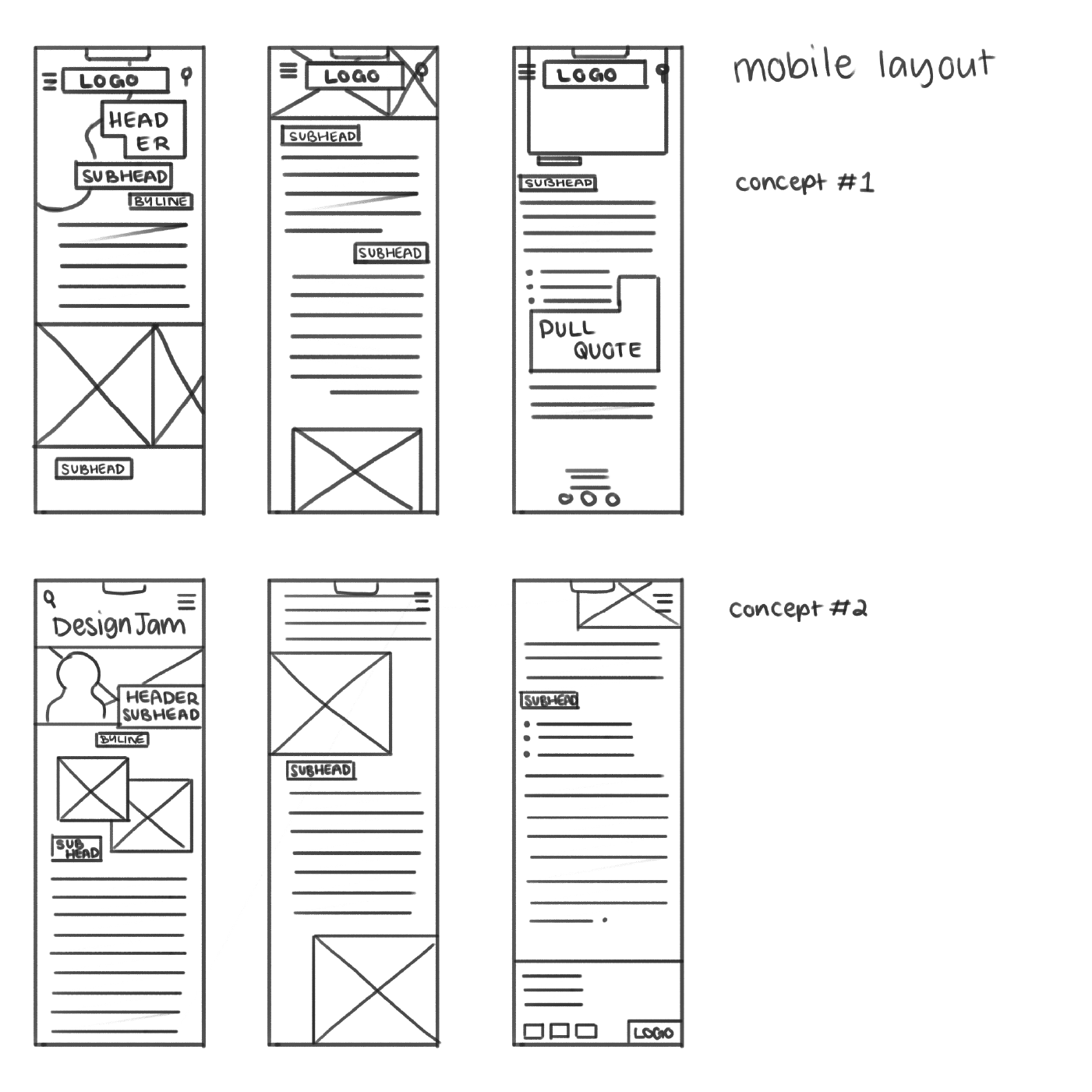
When adapting the design for digital publication, I pared back a lot of the overlapping elements, focusing more on how to creatively display Carson’s own artwork while maintaing legibility for screens.
Both of these assignments attracted a mark of 96+, and are currently being used as examples for current students at Billy Blue College of Design.